The Unglamorous Engineering Behind Research-Grade AI Slides
The demo is the easy 20 percent. ChatSlide's research workflow shows how picking a brutally demanding user turns unglamorous infrastructure into a moat.
 Shipped by Jules Pereira
There is a boring truth about AI products that founders keep relearning: the demo is the easy 20 percent. The last 80 percent is the unglamorous work that never makes the highlight reel. Few categories illustrate this better than AI slides, where "type a prompt, get a deck" is trivial and everything that makes it useful is hard.
ChatSlide's research workflow is a good case study, because it is essentially a general slide tool that chose to go down into the weeds of one demanding audience: academics.

Picking a hard user on purpose
Consumer users forgive a lot. Researchers forgive nothing. They arrive with a 200-page thesis, real experimental data, embargoed manuscripts, and a citation format their journal will reject them over. Building for them means solving problems a general deck-maker never has to touch.
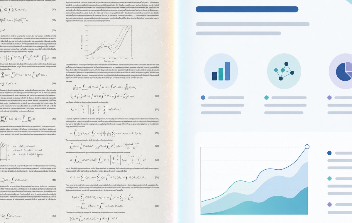
Start with input. Instead of a prompt box, the product has to swallow PDFs, Word files, Excel and CSV, scanned pages through OCR, and a direct PubMed search, then use vector search to stitch related passages together across a very long document. None of that is glamorous. All of it is load-bearing.
Charts are where competitors quit
The single most revealing engineering decision is charts. It is easy to generate a picture of a bar chart. It is hard to read the numbers in a document and render an actual, editable chart the user can correct. ChatSlide does the harder version with Chart.js and D3, including the domain-specific plots researchers expect, survival curves, dose-response, forest plots for meta-analyses.

That word, editable, is the tell. It is where most competitors quietly hand you back to PowerPoint, and it is exactly the kind of feature that does not fit in a thirty-second reel but shows up in retention.
The invisible moats: citations and trust
Two of the most defensible features are the ones you cannot screenshot. The first is a citation engine that outputs AMA, APA, IEEE, MLA, Chicago, and Vancouver, exports BibTeX, RIS, and EndNote, and resolves DOI and PMID metadata automatically. The second is a privacy posture built for pre-publication work: transient-memory processing, no training on user data, encrypted AWS storage with TLS 1.3, and IRB-aware handling for human-subjects research.

Neither ships in a launch tweet. Both are the reason a lab picks one tool and tells the other twelve members to use it too.
The lesson for builders
The takeaway is not "build for academics." It is that picking a genuinely demanding user forces you to build the unglamorous infrastructure that becomes your moat. Speed, real charts, citation plumbing, and defensible privacy are not features you demo. They are features you retain on. The founders who understand that difference tend to end up in the small group of tools that quietly become the default.
References
- ChatSlide, "AI Presentations for Research." chatslide.ai/research
- PRISMA, "Preferred Reporting Items for Systematic Reviews and Meta-Analyses." prisma-statement.org
- National Library of Medicine, "PubMed." pubmed.ncbi.nlm.nih.gov
- Chart.js, open-source charting library. chartjs.org
- D3.js, data-driven documents. d3js.org